Heather is a seasoned
Pinterest marketing expert & educator using the platform since you could reach the bottom of the feed - 2010.
About Heather Farris >
How to Create Branded Pinterest Designs to Boost Sales
January 9, 2025
You are spending hours creating Pinterest pins and maybe you hate every single thing that you put out. If you don’t understand what is working and what is not working with your Pinterest images–you don’t have branded Pinterest designs.
I can look at your images and I can see if you are using Pinterest keywords, targeting a specific audience, or if it’s for awareness or product sales. However, what is often lacking is the design.
Let me be clear: if your images are not clickworthy, you are not going to get people on your website, which is ultimately what you want them to do.
The pins don’t have to be really pretty, but you need at least a cohesive Pinterest design strategy. I don’t want you feeling like you are just throwing spaghetti at the wall.
Mistakes to not make with your branded Pinterest designs
I’m going to walk you through 8 mistakes that a lot of people are making when it comes to having branded Pinterest designs. Then I will teach you how to fix that and what it takes to create a cohesive pin design. Those mistakes are:
- Using multiple variations of templates without editing them for a brand vibe
- Using stock photos that don’t match the brand vibe
- Using different font groups
- Cluttering up the design with unnecessary elements
- Using different branding elements across imagery you are pinning
- Text aligned in odd positions
- Poor color choices
- Using overly saturated pin templates
So, if you don’t understand what makes Pinterest tick, when it comes to creating really pretty pins with branded Pinterest designs, then you can probably fall into a lot of these hang-ups that are going to leave you feeling beyond frustrated. Let’s fix that now that you’re in the right place.
Don’t use multiple template variations without editing them
First things first with mistake #1: using multiple variations of templates without editing them for a brand vibe. Let’s pretend that you are a creator and you are creating multiple different pieces of blog content and say you make three pins from three templates.
In this example, you can see multiple template variations, but there is no cohesive brand vibe. It just looks like three different creators, but it all goes to the same website.
You really don’t want to do that. What you really want is for people to know it’s you just by the branding.
RELATED: How to Create Fresh Pins for Pinterest in Canva: A Pinterest Image Workflow to Save Time
Don’t use stock photos that don’t match your brand vibe
Mistake #2 is using stock photos that don’t match your brand, your messaging, or your values. You don’t want to use stock photos where your entire brand is not represented.
For example, I see a lot of content creators, using stock photos with this flower flatlay here in this example. This is so very 2016, I did it myself, but I still see a ton of creators using these types of photos. If you want to do that, that’s ok, but it should match your overall brand aesthetic. It shouldn’t be haphazard just because it looks pretty.
Don’t use different font groups
Mistake #3 is using different font groups. If all of these were your pins above and have all these different fonts on all your pins, there is no cohesion.
If someone sees any two of these, they wouldn’t even know it was from the same creator. That’s the whole point of what we are trying to accomplish on this platform and with branded Pinterest designs. We want people to recognize our content when they see it, and with that comes the same fonts across all your pins.
RELATED: How to Recycle Your Pinterest Pins Without Looking Spammy
Declutter with less elements
Let’s move onto mistake #4, which is cluttering up your design with unnecessary elements. These three templates from Canva are examples of this. Yes, even in Canva templates.
Why do we need this hat with a flower? Why do we need this tape? This glitter? Why do we need this torn paper? I think we could do without all of these elements. We could just have a couple of images and the text. That’s it.
In the second example, no one is going to stop for that. It looks like a newspaper and, yes, I get that is the whole point. But no one is going to stop the scroll on Pinterest if you are cluttering up your entire pin with walls of text.
In this third example, we see all these weird arrows with this really bland stock photo. This is all unnecessary. I understand trying to make your pin look good, but at some point most people go overboard with it. You can actually reach a point where you are taking away from the main point of what you want your audience to get from your pin.
RELATED: 3 Types of Pinterest Pins (That Aren’t Video) For Your Marketing Strategy
Stop using different branding elements across your imagery
Mistake #5 is using different branding elements across imagery you are pinning. Let’s pretend that these last three pins are from the same creator. They have completely different brand elements across all three images. Calm down on using the arrows and glitter.
Choose a couple of different branding elements and sprinkle them throughout to make it look like it all belongs together. And use those same elements consistently, because that creates branded Pinterest designs.
Text shouldn’t be aligned oddly
Mistake #6 is using text aligned in odd positions, let me explain. In these examples, you can see in images 10 and 7, which are templates right out of Canva, that with a couple little tweaks, they could look much better (or much worse)
In pin 7, I don’t like how the words “to a” are on a line by themselves. It looks much cleaner to make the box for the text a little smaller.
Pin 9, I intentionally edited it to look wrong and messed up. Pin 10 is very nice. You would not believe how many times I see this type of text alignment that is in pin 9.
Just take the time to make sure your text is aligned in clean and clear ways. You don’t want your text all over the place. It is distracting to the eyes.
Poor color choices and contrast
Mistake #7 is poor color choices. Do not use super bright colors. You don’t want to use colors that are going to blind people.
Let’s calm our colors down and try to use things that are going to stop the scroll. The key is to use the bright colors as accents and not the main focus of the pin.
You don’t want to choose colors that are hard to read either, with rough contrast. For example, these pink and lime green colors are hard to read and chances are people are going to skip right past it, especially if you toss in script font. I see this done too often.
Stop using over saturated templates
Mistake #8 is using overly saturated pin templates, or templates used too often and seen commonly everywhere by too many brands.
If you go into Canva and then search for Pinterest templates, don’t always use the first design that pops up first. If you default to the same pin template, right up at the top, you are going to get skipped over visually.
Chances are everyone else are also using the pins that are at the top. You want to do your best to NOT look like everyone else. By using overly saturated pin templates, pinners on Pinterest are not going to be able to pick you out of a lineup.
I actually just saw a big Pinterest account doing this. I was flabbergasted that they are using these really common pin templates right out of Canva. So don’t feel bad if you are doing this, because even big brands are making these mistakes. All you can do is correct the mistakes now that you know better.
Those are the mistakes that I see on Pinterest when it comes to pin design. Now we are going to move on to what we can do better and look at some great examples of branded Pinterest designs.
RELATED: 10 Canva Hacks to Save You Time When Making Pinterest Pins
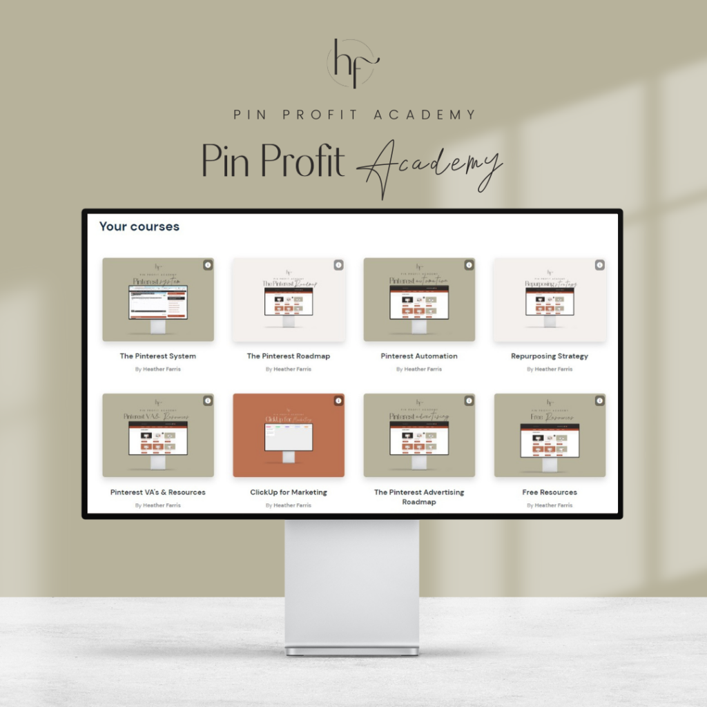
Pin Profit Academy
Marketing can be difficult and trying to figure it out on your own, especially with Pinterest, can be overwhelming.
I will show you how to double your traffic and sales without spending another minute on social media!
PPA is the only comprehensive membership program & community for creating, marketing & selling your products & services using Pinterest.
Things to do for great branded Pinterest designs
I am going to start with my pins as examples, and then share a handful of brands I think have really great brand designs. I get a lot of compliments on my Pinterest account and my Pinterest pins. There is really nothing truly special about what I’m doing. I am just very consistent with the elements and the design that I am using across platforms.
Here are the different ways we’ll discuss that create great cohesive branded Pinterest designs for your pins, that I recommend you follow.
- Choose 2-3 sets of templates and carry elements/mockups across
- Standardize your colors
- Choose 1-2 fonts and align them so it flows
- Limit the flair you add so pinners aren’t distracted
- Make sure you’re using calm color choices
- Try to stick to a theme with your stock photos
RELATED: Pinterest Best Practices to Get More Traffic & Sales
Using a few templates consistently
First step, you should use two or three sets of templates that have very similar elements across them.
You can see this template is very, very simple. I used a computer mockup and I have text overlay that says “read now,” and that is very, very similar to others across my pins. The only differences are the images across them.
That is also an example of using or creating a cohesive and branded look on Pinterest. What you want to do is use the same mockup devices and formatting for mockups on all your pins too. I use the same laptop mockup consistently with mine.
For example, if you have a lead magnet that you are sharing, make it look similar across all of the pins highlighting that lead magnet. Here is an example of my pins for my lead magnets.
They have the same mockup images and look very similar. If you look at my lead magnet and my Pinterest Strategy Guide, you are going to see that it is the same kind of layout.
There is an expectation from your viewers when you use the same elements. I am creating trust and consistency so when people see this, they will know it is from me.
“Yep, that is Heather Farris.” That is what I want people to think when they see my pins.
RELATED: Easy Guide To Creating Pins For Print On Demand Products
Standardize your colors
Moving on to standardizing your colors. When you look at your brand colors, there should be cohesion throughout.
Honestly, this is where hiring someone to do the branding, or purchasing a done-for-you brand kit, is better than doing it haphazardly. Please, put some focus into creating consistency in your colors so everything looks like it all matches.
Canva has some sample branding options you can apply. Or if you have colors, put them into Canva to use with your designs so you’re not guessing with every pin you make. Here’s mine as an example, I use these always with everything in my branded Pinterest designs.
You can use gradients if you want too. Canva recently released the ability to do gradients within your colors. Here is an example of a pin that I created using gradients. You can see how the color is lighter right behind the words and then it gets darker around the edges.
Note, that I am still using my brand colors, but the gradient is taking one of my brand colors and making it darker/lighter. Gradients are great to differentiate what your color schemes look like, but overall you really want to keep it in the family of colors that you have chosen for your brand.
RELATED: How to Batch Create Pinterest Pins for a Month Using Canva
Choose 1-2 fonts and align them
Next up is fonts. Honestly, this is probably the hardest for most people. We need to stick to 1-2 fonts, and align your fonts properly while creating branded Pinterest designs.
I mentioned before the mistake of aligning your fonts in a funky way and creating gaps in things. Let’s not do that. Instead you should choose 1-2 fonts and stick with those. Upload those into your Canva brand kit too. If you select fonts with multiple boldness options there’s more variety.
You will see on most of my pins, with very few exceptions, that I create 1-2 fonts and that is it! The pins that I make are all very consistent. I use the Poppins font across most of my pins and occasionally I’ll throw in my Nesans font.
Limit flair for less distractions
Next, limit the flair that you are adding so pinners aren’t distracted. You can see on my pins that I have almost no flair. There are very few lines, triangles, glitter, and all those other weird things. My pins are very simple and to the point.
Even if you scroll back to some of my older designs, I’m still using designs and there is a little bit of flair here and there. There might be a little swirl or arrow, but that is really it. I don’t want them to be too busy. In fact, you want them to be simple so the words and message that you are putting on your pins is getting across to your audience.
You can see that occasionally I’ll throw out a pin with all pink or other colors. I was testing them to see what they would look like. Feel free to do that and test things out! Occasionally you will see I have a YouTube thumbnail that totally looks out of place and that is because on that platform we are trying that out to see the response every once in a while. However, the consistency really remains the same.
RELATED: How To Make Pinterest Pins For Physical Products
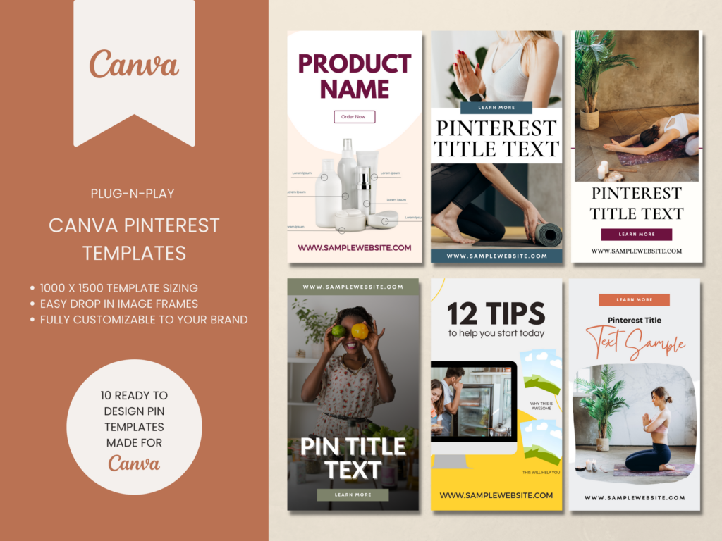
Video or Content Pinterest Templates
If you want traffic don’t rely on something just whipped up! Speed up your pin creation by using templates to get more pins out faster and more often.
These Pinterest templates are great for video content or blog posts & are ready to go. You can start creating pins on Pinterest in minutes.
Have calm color choices
The next thing that you want to look at is making sure that your color choices aren’t obnoxious and difficult to look at. I might have an occasional exception to this rule when I create a pin for my Shopify store, but overall don’t go obnoxious with your colors.
Cohesive across platforms too
You want your stuff to look cohesive in all places, even across all your social media platforms. You can see in this example, this curvature that I am using here is the same kind of curvature that I am using on my Pinterest pins. For my “read now,” or call to actions, they are all melted similarly throughout the pins, and also on my blog.
This example is a blog post image, then the pins associated with that blog post. This is a great way you can see it is all the same with my designs in different places. This should be your goal. If your viewer clicks through to a different platform, having completely different images can confuse them and distract them from where you want their attention to go.
RELATED: The Ultimate Pinterest Traffic Strategy for Bloggers & E-Commerce Shops
Tips for stock photos in branded Pinterest designs
A couple of tips for when you are looking for stock photos on Canva. When you are looking at your colors, also make sure to stick to a theme with your stock photos.
If you go to photos and you click the three dots on a photo, click the name of who submitted that photo to Canva, and you will be able to see all the photos that were submitted by that person. Likely, you’ll be able to find similar photos that will match for other pins you create.
Make sure that the Pinterest images throughout are also in the same family, as if you use ten different photos from one photo shoot across different types of pins. I wouldn’t go to Canva and look for plant photos that are done by completely different photographers with different styles.
However, if you were to click the name of the person who submitted the photos, you can see there will be tons of photos in that same family. This is great because it gives you even more cohesion.
Use the Canva brand kit for your branded Pinterest designs
Now, I want you to set up your brand kit. Make sure to add your templates, logos, color scheme, and fonts to your brand kit so that it is really easy when you go to edit a template. Then you can just apply a template that is already formatted for your brand, then plug and play with your images. Change the font up a bit if you want and change out the text. Then you are ready to go.
This makes it super easy when creating new pins and it won’t take you hours upon hours each time. That is the whole goal of this! We want to make it easier for you to create pins and to show you so that you can feel inspired.
RELATED: How To Use Canva Bulk Create With ChatGPT To Speed Up Your Pin Designs
Great Pinterest profiles with cohesive brand designs
Really well done with this Squarespace Magdalene Design Co. She has a set of templates that she is moving throughout. You can see she is using the same table kind of mockup style and the same page mockup style. She is differentiating between pins with no images and pins with images and text on them. I really like her stuff. She does a really good job and has an optimized profile.
This one is for a food creator, Clean Healthy Meals. This account also has cohesion with the way they do all of their pins. You can see they have a few different templates that they move through. Some of their pins are smaller, some longer, and a lot of them have more than one image. We see some infographics.
The next account is this e-commerce company called Brite Labs. They sell grow lights and they also give you plant care and indoor gardening tips. They have a lot of pins with this mockup style theme. Where you have the same yellow and green font family. You can see they use the same font throughout and then you see the occasional image, which kind of stands out from the rest.
The fourth, and final, example that I have for you is a well-known, well-established parenting style lifestyle blogger, Meraki Lane. This woman has been on the platform probably since 2010. She has over ¾ of a million followers on this platform so she is doing a really great job. Her content has always been consistent even though she uses slightly odd stock photos that kind of go with her theme.
You can see some of her content is all over with images of a weird baby, food, and then some fitness thrown in there too. However, it all goes within her lifestyle brand. What is cohesive is her pin design style. Her overall pin design style, you will always know that it is her. If you follow her and start to pay attention to her content, you will notice the design. It is always the same type of big words and little words that smash together in the black and white font. I have never known her to ever deviate from this in the 8+ years that I have been on this platform. The only thing that changes for this person are the stock photos, but you know and expect that from her.
Final thoughts on how to create branded Pinterest designs
The last thing to always remember is to create really seamless branded Pinterest designs so when you put out pins your audience knows it is you. This way we can stop spending hours creating Pinterest pins that might fall flat, and we can spend more time on what actually matters, which is the content, or the products, even the digital products that you are creating.
Pin it for later
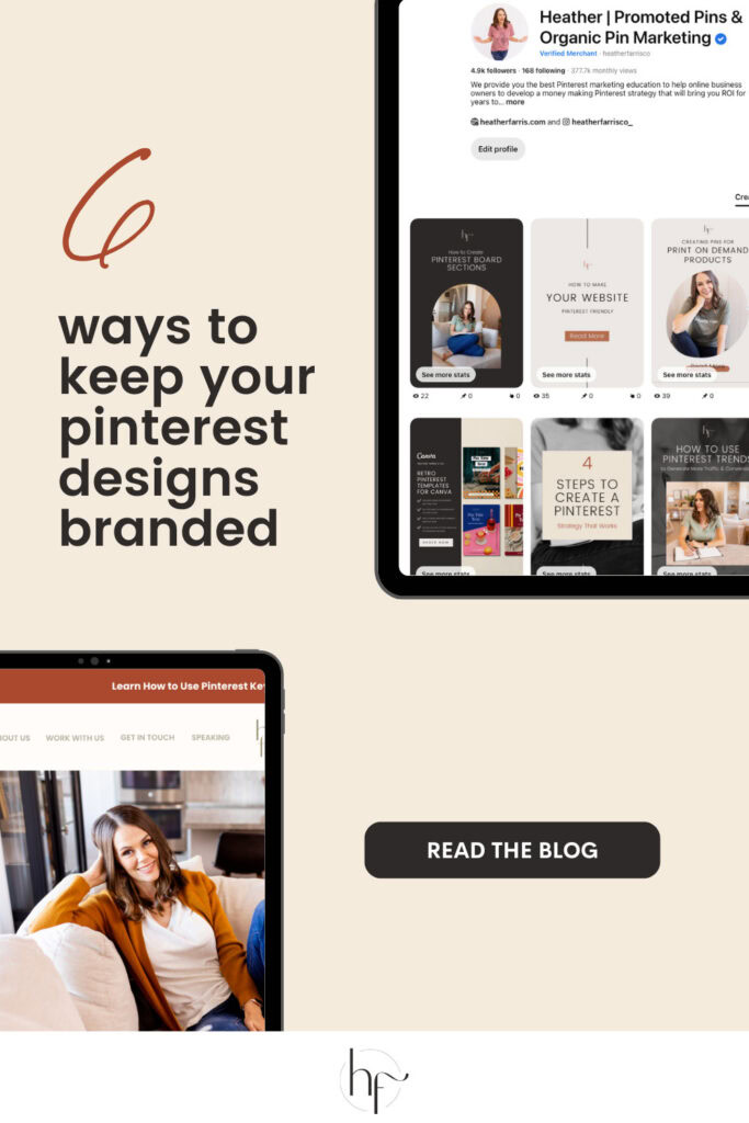
Heather Farris went to school for accounting and worked for years in banking and finance. After finding all of that entirely too boring she started her first blog in her basement in August of 2016. She has started 3 blogs in the marketing, motherhood and travel niches and used Pinterest to grow them all. She quickly became the go-to Pinterest strategist in her peer circles and has been implementing strategies, driving traffic and sales through organic and paid tactics for her clients. On this blog and her YouTube channel, as a renowned Pinterest marketing expert, she educates the public about clear and transparent marketing strategies to help them to grow on Pinterest and in other places online.
